Creating a visually appealing design often starts with understanding how colors work together. Whether you’re designing a website, interior space, or artwork, knowing how to assemble harmonious color schemes can make all the difference. The good news is that creating color harmony isn’t about complicated formulas or guessing games. It’s about understanding some core principles and applying practical techniques. With a little guidance, you can develop color schemes that feel balanced, vibrant, and pleasing to the eye.
Creating harmonious color schemes involves understanding color relationships, using tools and techniques to balance hues, and avoiding common pitfalls. With practice, you can naturally develop pleasing palettes that elevate any visual project, from digital designs to home decor.
Understanding the Foundations of Color Harmony
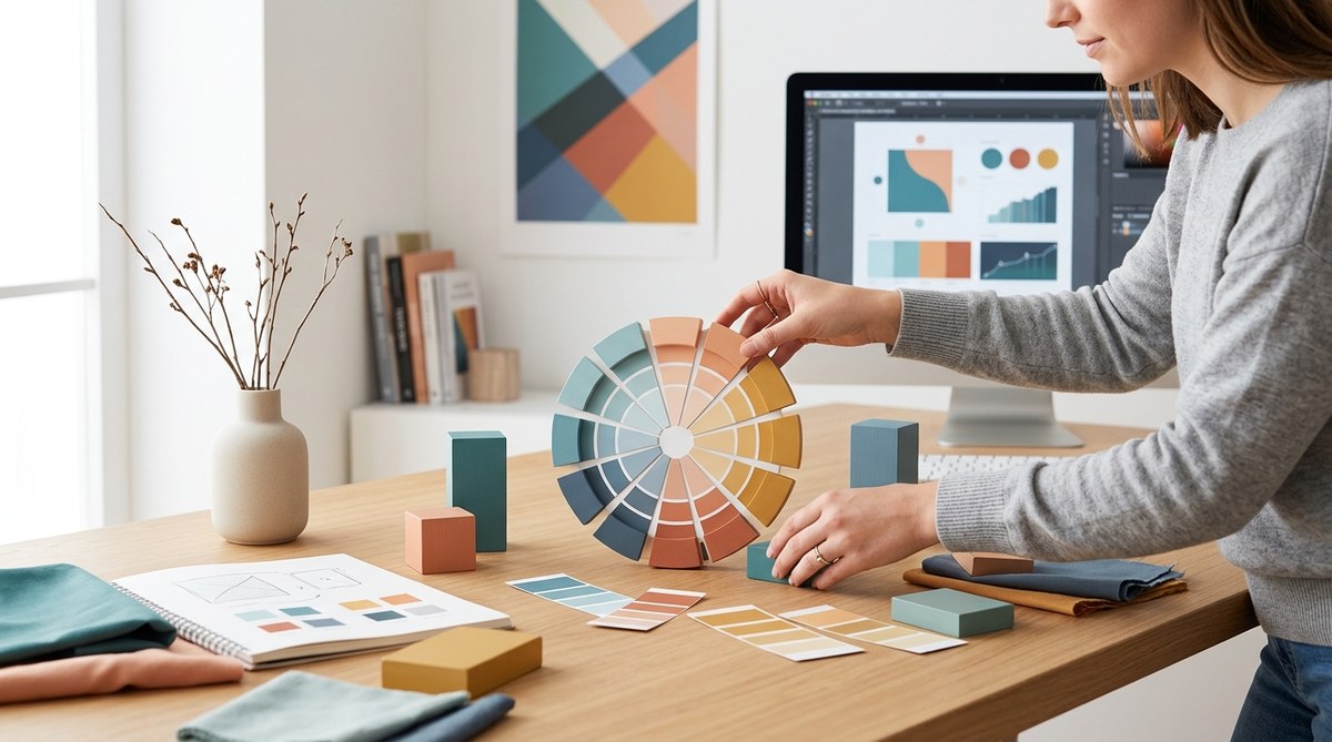
Before jumping into creating color schemes, it’s essential to grasp the basics of how colors relate to each other. The color wheel serves as a visual guide, illustrating relationships between hues. Harmonious schemes usually fall into a few main categories based on their position on the wheel.
The Classic Color Relationships
- Complementary: Colors directly opposite each other on the wheel. They create high contrast and vibrant combinations, like red and green.
- Analogous: Colors next to each other, such as blue, teal, and turquoise. They produce a serene, cohesive look.
- Triadic: Three equally spaced colors forming a triangle on the wheel, like red, yellow, and blue. These schemes are lively yet balanced.
- Tetradic (double complementary): Four colors forming a rectangle, offering rich variety but requiring careful balance.
Understanding these relationships helps in selecting colors that naturally work well together.
Why Color Harmony Matters
Harmonious color schemes make designs more engaging and easier to look at. They can evoke specific emotions or moods. For example, cool tones like blue and green create calmness, while warm tones like orange and red evoke energy. When colors are in harmony, they support the message or feeling you want to communicate.
Practical Techniques for Creating Harmonious Color Schemes
Knowing the theory is helpful, but practical application is key. Here are steps to craft balanced palettes effortlessly:
1. Start with a Base Color
Choose a primary hue that resonates with your project’s mood or theme. This could be a vibrant red for energy or a soft pastel for calmness. Use this color as the foundation for your scheme.
2. Use Color Relationships to Build Your Palette
Apply one of the relationship types to find complementary, analogous, or triadic colors. For example:
- For a soothing look, pick an analogous scheme with shades neighboring your base color.
- For contrast, choose a complementary color to your base.
3. Adjust Saturation and Value
Tweak the intensity (saturation) and brightness (value) of your colors. Lighten or desaturate hues to create depth and visual interest. Using muted versions of vibrant colors often results in more harmonious and sophisticated schemes.
4. Test Your Palette in Context
Apply your colors to mockups or sketches. See how they look together in real settings. Adjust as needed to ensure the scheme feels balanced.
5. Use Tools and Resources
Online color palette generators like Coolors or Adobe Color can help visualize relationships and generate harmonious schemes based on your input.
Common Mistakes to Avoid When Creating Color Schemes
Even experienced designers can stumble into pitfalls. Here are frequent errors and how to sidestep them:
| Mistake | Why it hurts | How to avoid |
|---|---|---|
| Overusing bright colors | Can overwhelm the viewer | Balance bright hues with neutral or muted tones |
| Ignoring contrast | Makes elements hard to distinguish | Ensure enough contrast between background and foreground colors |
| Using too many colors | Creates chaos | Limit your palette to three to five core hues |
| Not testing in context | Colors may clash in real use | Always preview your scheme in the actual medium |
As color expert Lisa Smith advises, “Always step back and view your palette from a distance. If it feels harmonious in your mind but looks chaotic on screen, refine your choices.”
How to naturally develop your sense of color harmony
Practice observing the colors in your environment. Notice how colors in nature, art, and even fashion combine. Over time, your eye will instinctively pick harmonious combinations, making your design process more intuitive.
Techniques to Enhance Your Color Schemes
Here are some additional methods to refine and develop your palettes:
- Monochromatic schemes: Use different shades, tints, and tones of a single hue for a unified look.
- Split-complementary: Pick a base color and use the two colors adjacent to its complement for a softer contrast.
- Color gradients: Transition smoothly from one hue to another, creating visual flow.
Practical tip
When in doubt, start with a neutral background and build your palette around it. This approach allows your colors to stand out without clashing.
Common Pitfalls and How to Spot Them
| Technique | Mistake | How to spot it | Solution |
|---|---|---|---|
| Complementary schemes | Overly vibrant, harsh | Colors feel jarring | Use softer shades or add neutral tones |
| Analogous schemes | Too monotonous | Colors blend into each other | Introduce contrast or accent colors |
| Bright, saturated colors | Eye strain | Colors feel overwhelming | Desaturate or tone down hues |
Elevate Your Design with Color Confidence
Knowing how to create harmonious color schemes naturally takes practice. Use your environment and tools to guide you. Remember, harmony isn’t about perfection but about balance and intention. As you experiment, you’ll develop an intuition for selecting colors that work effortlessly together.
Creating harmony in every project
Applying these principles, techniques, and awareness makes designing with color less daunting. Whether you’re refreshing a website, decorating a room, or illustrating a piece of art, harmonious palettes make your work more compelling. Don’t be afraid to try different combinations and trust your instincts. With time, creating balanced, pleasing color schemes will become second nature.
Happy designing!