Creating visually appealing designs hinges heavily on understanding how colors work together. Mastering color harmony isn’t just about picking pretty palettes; it’s about crafting a balanced, emotionally resonant visual experience. Whether you’re a student honing your skills or a professional fine-tuning your projects, grasping the principles of color harmony can transform your work from good to unforgettable.
Mastering color harmony involves understanding color relationships, applying effective schemes, and avoiding common mistakes. It helps create designs that are balanced, emotionally compelling, and visually cohesive, making your work stand out and resonate deeply with viewers.
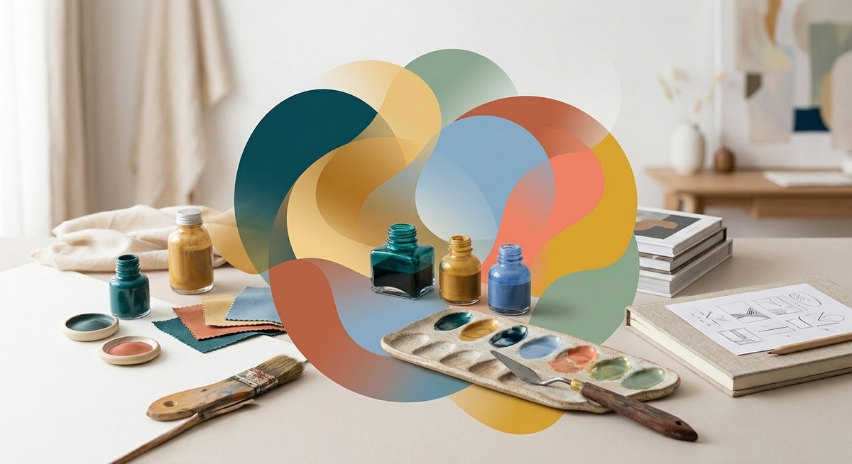
Understanding the foundation of color harmony
At its core, color harmony refers to the arrangement of colors that are pleasing to the eye. It’s rooted in the science of how colors interact on the color wheel and the psychological effects they evoke. When used skillfully, harmonious color schemes can guide viewers’ emotions, direct attention, and reinforce your message.
The concept isn’t about random color pairing. Instead, it involves deliberate choices that consider contrast, similarity, and tension to produce visual interest without chaos. To master this, you need to understand key color relationships and how to manipulate them effectively.
The role of the color wheel in achieving harmony
The color wheel is the backbone of color harmony. It’s a circular diagram that displays primary, secondary, and tertiary colors, helping designers visualize relationships and create schemes.
Key principles of the color wheel
- Primary colors: Red, blue, and yellow. These can’t be created by mixing other colors.
- Secondary colors: Green, orange, and purple. Made by mixing two primary colors.
- Tertiary colors: Colors formed by mixing primary and secondary colors, like yellow-orange or red-purple.
Understanding how these colors relate on the wheel helps you create schemes that feel natural and balanced.
Common color schemes derived from the wheel
- Monochromatic: Variations of a single hue, with different values and saturation levels.
- Analogous: Colors next to each other on the wheel, offering harmony and subtle variation.
- Complementary: Opposite colors on the wheel, providing high contrast and vibrancy.
- Split-complementary: A base color plus the two colors adjacent to its complement, balancing contrast with harmony.
- Triadic: Three colors evenly spaced around the wheel, delivering vibrant balance.
- Tetradic: Four colors forming two complementary pairs, creating rich, diverse palettes.
Practical steps to master color harmony
- Learn the basics of the color wheel: Familiarize yourself with primary, secondary, and tertiary colors. Know how they relate.
- Choose a primary scheme: Decide what mood or message you want. For calmness, monochromatic or analogous schemes work well. For energy, go for complementary or triadic schemes.
- Test different schemes: Use online tools like Adobe Color to experiment with schemes. Adjust the hue, saturation, and brightness to see what fits.
- Apply contrast thoughtfully: Use contrast to highlight important elements but avoid jarring combinations unless creating focal points.
- Check for accessibility: Ensure your colors have enough contrast for readability and are friendly for color-blind viewers.
- Iterate and refine: Keep tweaking until your palette feels balanced. Trust your eyes more than strict rules.
Common pitfalls and how to avoid them
| Technique | Mistake | How to avoid it |
|---|---|---|
| Overusing bright colors | Visual overload | Balance bright hues with neutral tones |
| Clashing schemes | Disjointed visuals | Stick to one scheme type per project |
| Ignoring cultural perceptions | Misinterpretation | Research color meanings relevant to your audience |
| Neglecting contrast | Poor readability | Test your palette in different contexts |
| Using too many colors | Visual clutter | Limit yourself to 3-5 main hues |
“The secret to powerful color harmony is understanding how colors influence emotion and behavior. When you choose your palettes with intention, your designs speak directly to viewers’ feelings.” — An experienced designer
Incorporating color psychology into harmony
Colors do more than look good. They evoke feelings and influence perceptions. Warm tones like red and yellow can energize or incite urgency. Cool colors like blue and green tend to calm and reassure. When selecting your schemes, consider the emotional response you want to trigger.
For example, a health app might favor calming greens and blues to promote trust, while a sports brand might opt for energetic reds and oranges to evoke excitement.
The importance of balance and contrast
Achieving harmony isn’t about matching everything perfectly. It’s about creating a visual rhythm where colors complement yet stand out. Contrast helps emphasize key elements, but too much can disrupt harmony. Balance ensures no single hue dominates excessively unless intentionally highlighted.
A simple way to check balance is to view your design from a distance or in grayscale. If the colors still feel cohesive, you’re on the right track.
Practical process for mastering color harmony
- Define your message: Know the mood or emotion you want.
- Select a base color: Start with a hue that aligns with your message.
- Build your palette: Use the schemes outlined above to choose supporting colors.
- Test your scheme: Use online tools or design software to visualize.
- Refine based on context: Adjust for readability, accessibility, and cultural relevance.
- Apply consistently: Use your palette across your project to reinforce harmony.
Common mistakes that undermine harmony
| Technique | Mistake | How to avoid it |
|---|---|---|
| Inconsistent color use | Confuses viewers | Stick to your palette |
| Ignoring context | Mismatched emotional tone | Adjust schemes for audience and purpose |
| Overcomplicating schemes | Visual clutter | Keep it simple and focused |
| Neglecting lighting and medium | Colors look different in context | Test designs in real-world settings |
Final thoughts on mastering color harmony
Achieving harmony in your designs is a skill that grows with practice and curiosity. Study color relationships, experiment with schemes, and always consider the emotional impact of your choices. Remember, color is a powerful tool that can guide perception, evoke feelings, and make your work unforgettable.
Keep learning, keep experimenting, and let your intuition guide you toward palettes that feel right. The more you understand the language of colors, the more expressive and effective your designs become.
A practical approach to color harmony for your projects
Start small by creating palettes for individual projects. Use online tools to visualize and adjust schemes. Always consider your audience and purpose. Over time, you’ll develop an instinct for choosing harmonious colors that elevate your work effortlessly.
Your designs tell stories through colors. Mastering the art of color harmony makes those stories resonate stronger. Happy designing!