Creating beautiful, balanced color combinations is both an art and a science. Whether you’re designing a logo, decorating a space, or crafting digital artwork, understanding how to create harmonious color blends can make your projects stand out. The secret lies in knowing how colors interact, complement each other, and evoke the right emotions. This guide will walk you through everything you need to master harmonious color blends and bring your creative visions to life.
Creating harmonious color blends involves understanding color relationships, choosing suitable schemes, and balancing colors to evoke the desired mood. Practical steps and awareness of common pitfalls help craft visually appealing designs that resonate with viewers.
Understanding the Foundations of Color Harmony
Before jumping into specific palettes or techniques, it’s essential to grasp the basic principles of color harmony. Colors influence emotions and perceptions, so selecting the right combinations can dramatically impact your project’s success.
What Is Color Harmony?
Color harmony refers to the pleasing arrangement of colors that work well together. When colors are in harmony, they create a balanced and cohesive look. Achieving this involves understanding how colors relate on the color wheel, their psychological effects, and their contextual use.
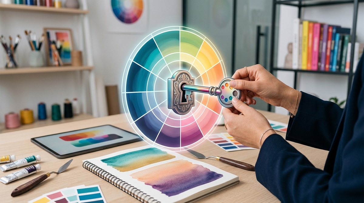
The Color Wheel and Its Role
The color wheel is a circular diagram representing colors as they relate to each other. It helps visualize relationships like complementary, analogous, and triadic schemes. Recognizing these relationships allows you to craft blends that feel natural and engaging.
Color Properties That Affect Harmony
Colors have three primary properties:
- Hue: The color itself (red, blue, yellow, etc.)
- Saturation: The intensity or purity of the color
- Brightness: How light or dark the color appears
Balancing these properties helps create visually appealing blends that are neither dull nor overwhelming.
Practical Steps to Create Harmonious Color Blends
Here’s a straightforward process to guide your creative workflow:
1. Define Your Project’s Mood and Purpose
Identify the emotion or message you want to convey. Bright colors evoke energy and happiness, while muted tones suggest calmness. Clarifying your intent helps select appropriate color schemes.
2. Choose a Dominant Color
Select the main color that reflects your project’s theme. This will be the anchor around which other colors revolve.
3. Select Supporting Colors Based on a Scheme
Pick supporting colors that complement or contrast with your dominant hue. Use color schemes like analogous, complementary, or triadic to ensure harmony.
4. Adjust Saturation and Brightness
Fine-tune your colors to maintain balance. Avoid overly saturated colors unless you want a vibrant look, or opt for softer shades for subtlety.
5. Test and Refine
Apply your colors to your design and see how they work together. Make adjustments as needed to enhance harmony and ensure readability or visual impact.
Popular Color Schemes for Harmonious Blends
Different schemes serve different design needs. Here’s a look at some of the most effective options:
Analogous Colors
Colors next to each other on the wheel. They create seamless transitions and a calm, cohesive look.
Complementary Colors
Colors opposite each other. They produce vibrant contrasts but require careful balancing to avoid visual tension.
Split-Complementary
A primary color combined with the two colors adjacent to its complement. This scheme offers contrast with less intensity.
Triadic Colors
Three colors evenly spaced around the wheel. They generate a lively, balanced palette.
Tetradic (Double-Complementary)
Two complementary pairs. Ideal for complex, rich designs but needs careful balancing.
Monochromatic
Variations in saturation and brightness of a single hue. Minimalist and elegant, perfect for a sleek, unified appearance.
Common Mistakes in Creating Harmonious Blends
To avoid pitfalls, be aware of these common errors:
| Mistake | Why it’s a problem | How to avoid it |
|---|---|---|
| Overuse of bright colors | Can be overwhelming | Balance with neutral tones |
| Clashing schemes | Creates visual discord | Stick to one scheme at a time |
| Poor contrast | Reduces readability | Test combinations for clarity |
| Ignoring context | Colors may feel out of place | Consider cultural and emotional impacts |
Expert Tips for Achieving Perfect Color Blends
“Balance is key. Use a dominant color and support it with accents, then tweak saturation and brightness to perfect the harmony.” — Color expert Jane Doe
Practical Advice
- Use tools like Adobe Color to experiment with schemes.
- Keep your palettes simple for clarity.
- Consider accessibility and ensure sufficient contrast for readability.
- Remember that lighting conditions affect how colors appear.
Practical Process for Creating Harmonious Color Blends
- Identify your project’s mood and message.
- Choose a main color aligned with your intent.
- Select supporting colors from a harmonious scheme.
- Adjust saturation and brightness for balance.
- Apply and review your palette in context.
- Make iterative tweaks to refine harmony.
How to Avoid Common Pitfalls
- Don’t rely solely on vibrant colors. Balance them with neutrals.
- Use color scheme generators for inspiration.
- Test your palette across different devices or print to ensure consistency.
- Gather feedback from others to spot any discordant elements.
Enhancing Your Design Skills with Color Science
Understanding color relationships gives you an edge in creating blends that feel natural and appealing. Learning about color psychology can also add depth to your choices, making your designs more compelling and emotionally resonant.
Final Words for Creative Color Blenders
Mastering the art of creating harmonious color blends takes practice and patience. Start with simple schemes, experiment freely, and always consider the emotional impact of your choices. Over time, you’ll develop an intuitive sense for what works, enabling you to craft designs that captivate and communicate effectively. Remember, every successful project begins with a thoughtful color palette that speaks to your audience.