Creating visually appealing designs hinges on understanding how colors interact. Mastering color harmony is the secret weapon for any designer aiming to craft work that captures attention and evokes emotion. Whether you are working on branding, interior spaces, or digital art, grasping the fundamentals of color relationships transforms your creative process. This guide unpacks the core principles of mastering color harmony and offers practical steps to elevate your designs effortlessly.
Mastering color harmony involves understanding [the color wheel](https://en.wikipedia.org/wiki/Color_wheel), balancing colors thoughtfully, and applying schemes that evoke specific emotions. Applying these principles leads to more cohesive, engaging visuals that resonate with your audience.
Understanding the Foundations of Color Harmony
Before diving into techniques, it’s essential to grasp what color harmony truly means. At its core, it’s about selecting colors that work well together, creating a sense of balance and unity in your design. When colors are harmonized correctly, they guide the viewer’s eye, evoke emotions, and reinforce your message.
Color harmony is rooted in the science of color relationships. It leverages the color wheel, a circular diagram representing the relationships between hues. The wheel helps designers visualize how different colors interact and which combinations tend to be most pleasing or intentionally striking.
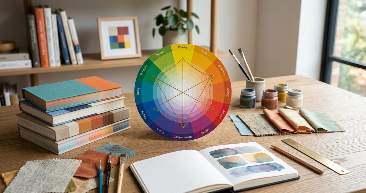
The Role of the Color Wheel in Creating Harmony
The color wheel is your primary tool for mastering color harmony. It displays the relationships between primary, secondary, and tertiary colors, offering a clear visual guide for selecting color schemes. Understanding how to read and interpret the wheel empowers you to build designs that feel natural and visually engaging.
Key components of the color wheel include:
- Primary colors: Red, blue, and yellow. These cannot be created by mixing other colors.
- Secondary colors: Orange, green, and purple. They result from mixing primary colors.
- Tertiary colors: The result of mixing primary and secondary colors, such as red-orange or blue-green.
How to use the color wheel:
- Identify the dominant hue in your project.
- Choose complementary, analogous, or triadic schemes based on your desired effect.
- Adjust proportions to balance the overall harmony.
Fundamental Principles of Color Harmony
Mastering color harmony involves applying several core principles. Here are the most effective ways to create balanced and compelling color combinations:
1. Choose a base hue and build around it
Start with a dominant color that sets the tone. This hue should reflect the mood or message you want to convey. From there, select supporting colors that complement or contrast harmoniously.
2. Use color schemes intentionally
Color schemes are predefined arrangements of colors on the wheel that evoke specific emotions. Common schemes include:
– Monochromatic: Variations of a single hue, creating a unified look.
– Analogous: Colors next to each other on the wheel, offering harmony and subtlety.
– Complementary: Colors opposite each other, providing vibrant contrast.
– Split-complementary: One hue plus the two colors adjacent to its complement, balancing contrast with harmony.
– Triadic: Three evenly spaced colors, producing vibrant and balanced palettes.
– Tetradic: Two pairs of complementary colors, offering rich variety but requiring careful balance.
3. Balance proportions and saturation
Even harmonious colors can become overwhelming if not balanced properly. Use proportion strategies like 60-30-10 to distribute colors. Adjust saturation and brightness levels to prevent any one color from dominating.
4. Consider color temperature and psychological effects
Colors are perceived as warm or cool. Warm hues like red and orange evoke energy and excitement, while cool hues like blue and green create calmness. Tailoring your palette to the intended mood enhances the overall impact.
Practical Steps for Mastering Color Harmony
Applying these principles requires a clear process. Here are steps to guide your practice:
- Identify your project’s mood and purpose. Decide what emotions you want to evoke.
- Select a dominant hue that aligns with your goal.
- Pick supporting colors based on the scheme that suits your project (e.g., complementary for contrast or monochromatic for harmony).
- Test your palette using tools like color scheme generators or the color wheel.
- Adjust proportions to achieve a balanced look.
- Apply your colors thoughtfully, considering lighting, texture, and context.
- Review and refine by stepping back or seeking feedback to ensure harmony.
Common Mistakes and How to Avoid Them
| Mistake | Why it happens | How to prevent it |
|---|---|---|
| Using too many colors | Creates chaos and confusion | Limit your palette to 3-5 core colors |
| Ignoring contrast | Makes elements hard to distinguish | Ensure sufficient contrast for readability |
| Over-saturating colors | Overwhelms the viewer | Use muted or desaturated tones for balance |
| Relying solely on schemes without testing | Misses the actual visual impact | Always test colors in context before finalizing |
“Understanding the relationship between colors gives you the power to craft designs that feel intentional and emotionally resonant,” advises graphic designer Jessica Lee. She emphasizes that experimentation and observation are key to mastering color harmony.
Practical Techniques to Elevate Your Color Harmony Skills
- Use a color wheel to identify complementary and analogous pairs quickly.
- Create mood boards to visualize how color schemes work in real settings.
- Incorporate neutral tones to ground vibrant palettes.
- Adjust saturation levels to create depth and focus.
- Use software tools like Adobe Color or Coolors to generate harmonious palettes.
Common Techniques and Pitfalls in Color Harmony
| Technique | Description | Mistake to Avoid |
|---|---|---|
| Monochromatic schemes | Variations of a single hue | Overusing a single tone, making the design dull |
| Complementary schemes | Colors opposite on the wheel | Using high saturation on both can clash |
| Analogous schemes | Neighboring colors | Lack of contrast may result in a flat look |
| Triadic schemes | Equidistant colors | Colors may compete if proportions aren’t balanced |
Final Tips for Consistent Color Mastery
- Always test your color choices in actual design contexts.
- Consider accessibility; ensure sufficient contrast for readability.
- Be mindful of cultural associations with colors.
- Keep your palette flexible for future adjustments.
Nurturing Your Color Harmony Skills Over Time
Mastering color harmony is a continuous journey. Observe how colors work in the world around you. Build a library of palettes inspired by nature, art, and daily life. Regular practice and experimentation will deepen your understanding and intuition.
Your Next Steps in Color Mastery
Start small by creating color palettes for personal projects. Use online tools to test different schemes. Share your work and gather feedback. Over time, your eye for harmonious color combinations will sharpen, making your designs more compelling and memorable.
Final words for confident designers
Color harmony is not just about choosing pretty colors. It’s about communicating, evoking feelings, and guiding viewers through your work seamlessly. By understanding the principles and applying them intentionally, you’ll craft designs that resonate deeply. Keep practicing, stay curious, and let your color choices tell a story that sticks with your audience.