Skip to content
colorcrush.cc
  • Color Theory
  • Color Palettes
  • Design Inspiration
  • Color Mixing
  • UI Colors
  • Visual Design
  • Blog
  • Color Theory
  • Color Palettes
  • Design Inspiration
  • Color Mixing
  • UI Colors
  • Visual Design
  • Blog
Home » Blog » Page 2
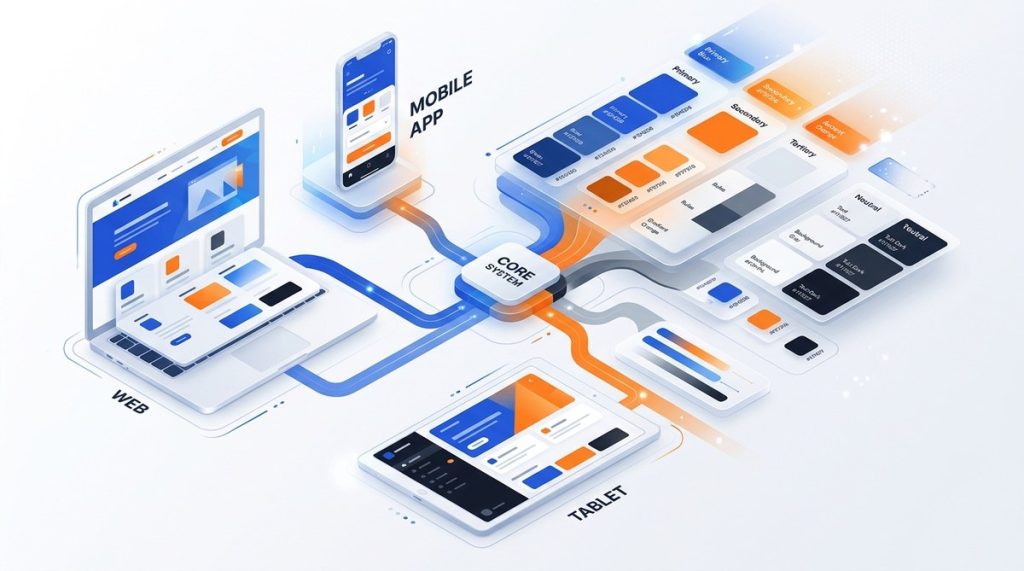
How to Build a Scalable Color System for Multi-Platform Design
Posted inBlog

How to Build a Scalable Color System for Multi-Platform Design

Posted by By evelyn 14 October 2026
Building a color system that works across web, iOS, and Android is one of the hardest problems in design systems. Each platform renders color differently. Each team has their own workflow. And without...
Read More
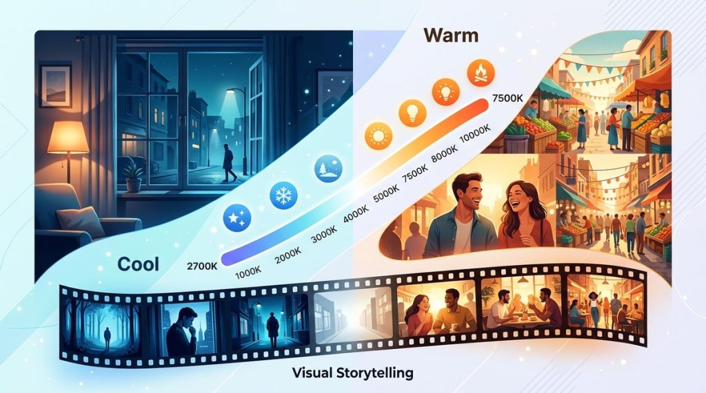
What Is Color Temperature and Why Does It Matter for Visual Storytelling?
Posted inBlog

What Is Color Temperature and Why Does It Matter for Visual Storytelling?

Posted by By evelyn 13 October 2026
The sun dips below the horizon, and the world turns a deep, golden orange. You feel calm, maybe a little nostalgic. Now walk into a fluorescent-lit office. The air feels sterile, cold, and slightly te...
Read More
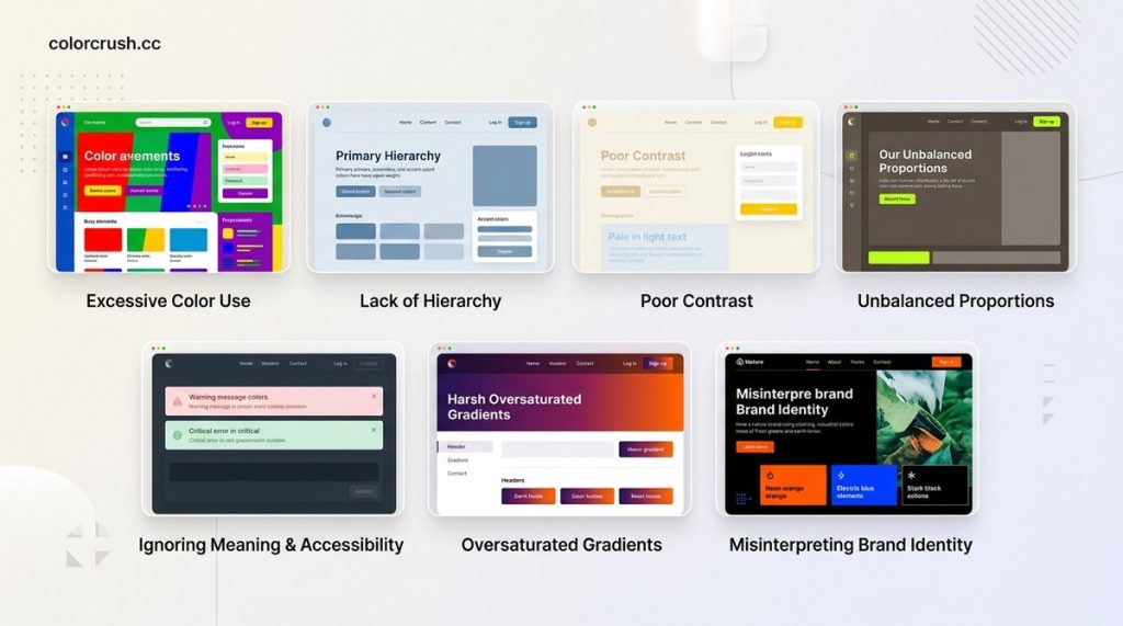
7 Color Palette Mistakes That Make Your UI Look Dated
Posted inBlog

7 Color Palette Mistakes That Make Your UI Look Dated

Posted by By evelyn 10 October 2026
You open a portfolio from a designer you admire. The layout is clean. The typography is sharp. But something feels off. It looks like it was built in 2019. The colors are the culprit. Outdated color c...
Read More
How to Choose the Perfect Accent Color for Your Brand in 2026
Posted inBlog

How to Choose the Perfect Accent Color for Your Brand in 2026

Posted by By evelyn 7 October 2026
Your brand’s main color might be a deep navy blue. Your secondary color could be a crisp white. But the accent color? That is the small pop of personality that makes people stop scrolling. Think of th...
Read More
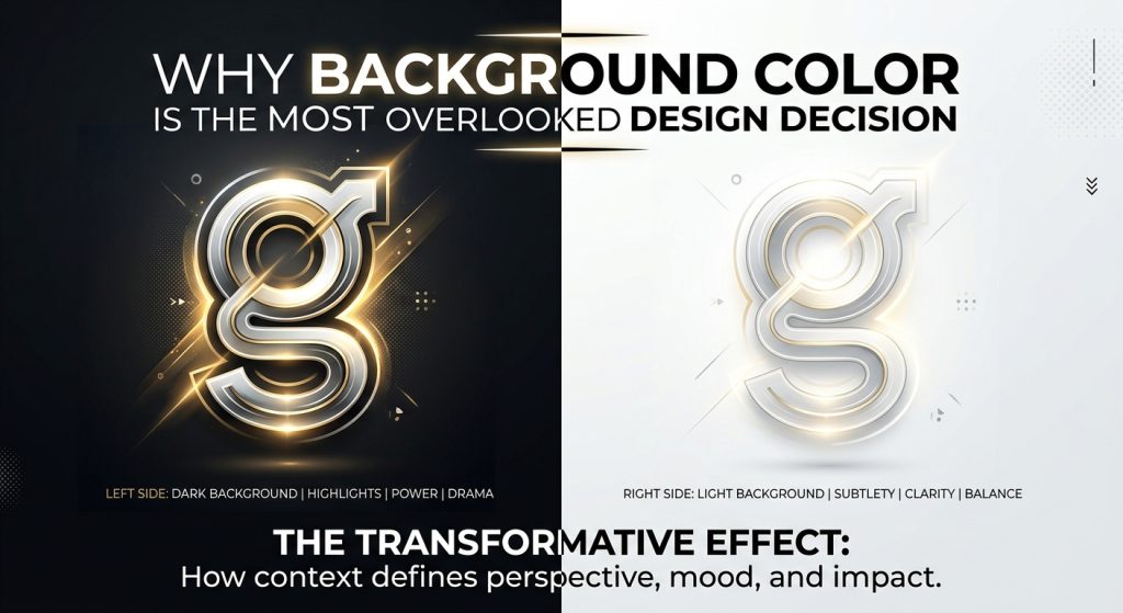
Why Background Color Is the Most Overlooked Design Decision
Posted inBlog

Why Background Color Is the Most Overlooked Design Decision

Posted by By evelyn 20 September 2026
Background color shapes contrast, hierarchy, and emotion more than any other choice. Learn why it matters and how to pick yours with confidence.
Read More

Posts pagination

Previous page 1 2

Recent Posts

  • Why Analogous Color Schemes Are the Secret to Sophisticated UI Design
  • Why Every Designer Needs a Personal Color Palette in 2026
  • How to Build a Balanced Color Palette From Artwork for Web Design
  • The Ultimate Guide to Using Complementary Colors Without Clashing
  • 10 Color Combinations That Instantly Elevate Your Web Design

Archives

  • October 2026
  • September 2026
  • June 2026
  • May 2026
  • April 2026

Categories

  • Blog
  • Color Mixing
  • Color Palettes
  • Color Theory
  • Design Inspiration
  • UI Colors
  • Visual Design
Scroll to Top