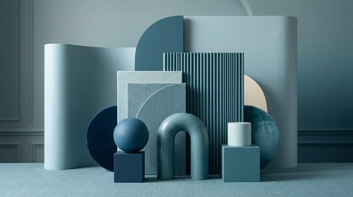
You have probably seen a room or a brand that sticks to one color and somehow still looks boring. It happens all the time. A designer picks a single hue, uses it everywhere, and the result feels like a washed out afterthought. That is the risk of monochromatic color palette design. But here is the truth: when done right, a single color scheme can feel richer and more sophisticated than any rainbow of hues. The secret is not about adding more colors. It is about layering depth, texture, and contrast within the same family.
A flat monochromatic scheme happens when you ignore value, saturation, and texture. To make a single color feel alive, you need at least five distinct stops on the value scale, a mix of warm and cool undertones, and tactile or visual texture. Use the 60-30-10 rule even within one hue. Layer matte, glossy, and patterned surfaces. That is how you create a monochromatic palette that breathes.
Why Monochromatic Schemes Get a Bad Reputation
Many people associate monochromatic design with dorm rooms painted entirely beige or a logo that uses one shade of blue on a white background. Those examples feel flat because they lack variation. The eye craves contrast. When you use the same saturation and brightness across an entire space or composition, there is nothing for the brain to latch onto.
The best monochromatic color palette design mimics nature. Look at a forest in summer. It is mostly green, but you see dark pine needles, bright lime moss, olive shadows, and yellow green sunlit leaves. That is a monochromatic palette with depth. Your job is to recreate that kind of layered richness using your chosen hue.
The Anatomy of a Single Hue
Before you start picking swatches, understand what makes up a color. Every hue has three dimensions.
- Hue: The pure color itself (red, blue, yellow, etc.).
- Saturation: The intensity or purity of the color. High saturation feels bold. Low saturation feels muted or grayed.
- Value: The lightness or darkness of the color. Light values are tints. Dark values are shades.
A flat monochromatic scheme uses the same value and saturation across the board. A dynamic scheme shifts both. You can keep the same hue but move through a wide range of tints, shades, and tones. That is where the magic happens.
How to Build a Monochromatic Palette That Feels Layered
Follow this numbered process to create a palette that has dimension.
-
Choose your anchor hue. Pick a color you genuinely love. It could be a deep navy, a dusty rose, or a warm olive. This anchor will be your middle value. Do not start with the lightest or darkest version. Start in the middle so you can expand in both directions.
-
Map five value stops. Take your anchor hue and create a scale from very light to very dark. You need at least five distinct steps. For example, if your anchor is a mid tone teal, your lightest stop might be a pale aqua and your darkest stop a deep forest teal. Test them side by side. You should see clear jumps between each step.
-
Adjust saturation for interest. Not every stop needs the same intensity. Let your lightest tints be slightly desaturated so they feel soft. Let your darkest shades be rich and saturated. This variation prevents the palette from feeling artificial.
-
Introduce a near neutral. Pick one color that sits very close to gray but still carries a hint of your anchor hue. Use this for large background areas. It gives the eye a rest and makes the purer versions of your color pop.
-
Add a micro accent. Choose one tiny element that uses a slightly different temperature of your hue. For a blue palette, that might be a touch of teal leaning green. For a pink palette, a whisper of coral. This micro accent should cover less than 5 percent of the composition.
Techniques for Adding Depth Without Adding Colors
You do not need more hues to create visual interest. Use these methods instead.
| Technique | What It Does | Example |
|---|---|---|
| Value contrast | Creates hierarchy and focus | Pair a pale lavender wall with deep violet furniture |
| Saturation shift | Adds energy or calm | Use a muted sage for walls and a bright emerald for an accent chair |
| Texture variation | Engages touch and sight | Combine a glossy tile backsplash with matte painted cabinets |
| Pattern layering | Adds complexity within the same hue | Use a striped throw pillow on a solid sofa, both in different shades of blue |
| Temperature play | Creates subtle tension | Mix a warm terracotta with a cooler brick tone |
Each of these techniques keeps your palette strictly monochromatic while making the space or design feel anything but flat.
Common Mistakes That Make a Monochromatic Palette Fall Flat
Avoid these traps. They are the reason most single color schemes look unfinished.
- Using only one value. If everything is the same lightness, the design reads as a single block. Always include a light, a mid, and a dark.
- Forgetting about undertones. A cool gray and a warm gray are not the same. If you mix them without intention, the palette looks muddy. Stick to one undertone family.
- Skipping texture. In a monochromatic room, texture is your best friend. Without it, even a well chosen value scale can feel sterile.
- Ignoring the 60-30-10 rule. Use your lightest value for 60 percent of the space, your mid value for 30 percent, and your darkest value for 10 percent. This distribution creates balance.
- Being afraid of white space. Negative space in a monochromatic design is not empty. It is a breathing room that lets your color shine.
“A monochromatic palette is not about using less color. It is about using color with more precision. Every shade, every texture, every finish must earn its place.”
Mia Torres, color strategist and author of The Hue Code
Real World Examples for Different Design Fields
For Interior Designers
Imagine a living room built around a single warm gray. The walls are painted a light greige with a matte finish. The sofa is a mid tone charcoal in a textured linen. Throw pillows shift between a soft silver velvet and a deep graphite knit. The coffee table is a dark stained wood that reads almost black. A single ceramic vase in a pale dove gray sits on the table. Every element stays within the gray family, but the mix of matte, linen, velvet, and wood grain makes the room feel layered and inviting.
For Graphic Designers
A brand identity for a skincare line uses only shades of rose. The logo is a deep berry. Headlines are a dusty rose. Body text is a muted blush. Backgrounds use a barely there pink. The designer adds depth by using a gradient from light to dark on the website hero section and by pairing a solid rose shape with a rose colored photograph. The result feels luxurious and cohesive without being boring.
For DIY Decorators
You can apply this to a single room refresh. Pick one color you already love. Paint an accent wall in a deep shade of that color. Keep the other walls a light tint. Add a rug that includes several values of the same color. Swap out throw blankets and pillow covers to match your chosen range. That is enough to transform the space without buying all new furniture.
How to Test Your Palette Before Committing
Do not guess. Test your monochromatic color palette design before you paint a wall or finalize a brand guide.
- Create a physical or digital swatch board. Arrange your five value stops plus your near neutral and micro accent. Look at them under different lighting.
- Check contrast in black and white. Convert your palette to grayscale. If the values blend together, you need more separation.
- Live with it for 24 hours. Tape swatches to a wall or pin them to a board. Walk past them throughout the day. Notice how they feel in morning light versus evening light.
- Ask for a second opinion. Show your palette to someone who does not design for a living. If they say it looks like one color, you have more work to do.
For more guidance on building a full color system that works across platforms, read our guide on how to build a scalable color system for multi-platform design. It covers how to extend a single hue into a complete toolkit.
The Role of Lighting in Monochromatic Design
Lighting changes everything. A monochromatic palette that looks perfect in a showroom can feel dull in a north facing room. Natural light, warm bulbs, and cool LEDs all affect how a single hue reads.
- North facing rooms get cool, blue light. Warm hues like peach or terracotta help balance the coolness.
- South facing rooms get warm, golden light. Cool hues like sage or slate feel refreshing.
- Warm artificial light (2700K to 3000K) makes warm hues glow and can muddy cool hues.
- Cool artificial light (4000K to 5000K) makes cool hues crisp and can wash out warm hues.
Test your palette under the lighting conditions where it will actually live. That simple step prevents disappointment.
When to Break the Rules
Rules are meant to guide you, not trap you. Once you understand the principles of value, saturation, and texture, you can break them on purpose.
- Use only two values for a minimalist, high impact look.
- Use high saturation across the board for a bold, maximalist statement.
- Use all matte textures for a soft, quiet atmosphere.
The key is intention. If you break the rules, do it because you chose to, not because you forgot.
If you want to see how other designers handle color restrictions, check out our piece on the 3-color rule and why limiting your palette creates more professional designs. It reinforces the same principle: constraints breed creativity.
Your Monochromatic Palette Is Ready
You now have a clear process. Pick your anchor hue. Build five value stops. Adjust saturation. Add a near neutral and a micro accent. Layer in texture, pattern, and temperature. Test under real light. That is the formula for a monochromatic color palette design that feels rich, intentional, and anything but flat.
Start with one color you already love. Map out your five stops today. Even a small test, like rearranging a bookshelf by value within a single color family, will teach you more than reading a dozen articles. The best way to learn is to do. Grab a swatch fan or open your design software and build your palette. Your future self will thank you.