Color is the soul of any visual project. Whether you’re designing a website, creating an artwork, or developing a branding palette, understanding how colors work together can make your work stand out. Achieving harmony in your color choices ensures your designs are pleasing to the eye and emotionally resonant. This guide walks you through the essentials of color harmony in design, offering practical steps and expert tips to elevate your visual creations.
Mastering color harmony in design involves understanding color relationships, schemes, and psychological effects. Applying these principles helps create visually balanced, engaging, and emotionally impactful projects that resonate with viewers and elevate your work.
Why Color Harmony Matters in Design
Color harmony is about creating relationships between colors that feel natural and balanced. When colors are in harmony, they guide the viewer’s eye, evoke specific emotions, and reinforce your message. Without harmony, a design can feel chaotic or unprofessional. Proper color relationships make your work more cohesive and compelling.
Good color harmony enhances usability, especially in UI/UX design. It ensures buttons stand out, text remains readable, and the overall experience feels intuitive. Artists use harmony to evoke emotions and establish mood. For example, warm tones can foster comfort, while cool shades might evoke calmness.
Achieving harmony is not just about aesthetics. It’s about understanding how colors interact and influence perceptions. When you master this, your designs become more effective at communicating and capturing attention.
The Foundations of Color Harmony in Design
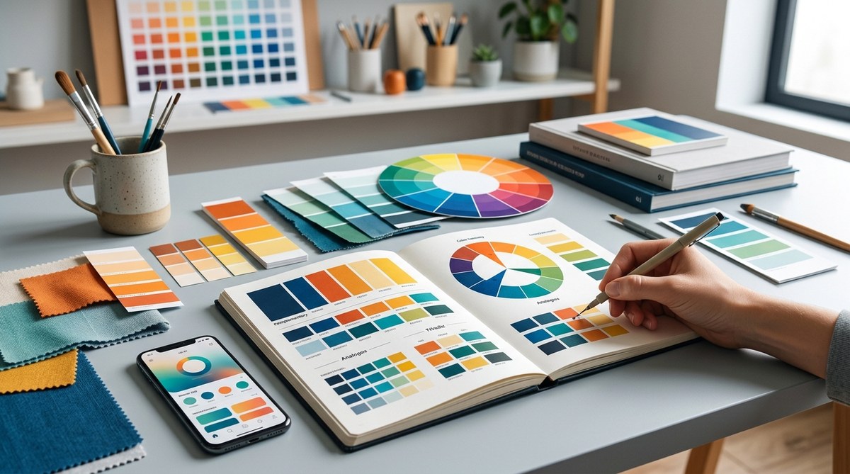
Before you can create harmonious color schemes, it helps to understand the basics of color relationships. This involves knowing the color wheel, color attributes, and how different colors relate to each other.
Understanding the Color Wheel
The color wheel is a circular diagram showing the relationships between colors. It’s divided into primary, secondary, and tertiary colors. Primary colors (red, blue, yellow) cannot be created by mixing other colors. Secondary colors (green, orange, purple) result from mixing primaries. Tertiary colors are a blend of primary and secondary hues.
Color Attributes: Hue, Value, Saturation
- Hue: The actual color (red, blue, green, etc.).
- Value: How light or dark a color appears.
- Saturation: The intensity or purity of a color.
Knowing these attributes helps you fine-tune your color choices for harmony and contrast.
Color Harmony and Schemes
Color schemes are pre-defined relationships between colors that consistently look good together. Here are the most common schemes:
- Monochromatic: Variations of a single hue, using different values and saturation levels.
- Analogous: Colors next to each other on the wheel, creating a harmonious and natural look.
- Complementary: Opposite colors on the wheel, providing high contrast and vibrancy.
- Split-complementary: A base color plus the two colors adjacent to its complement, offering contrast without harshness.
- Triadic: Three evenly spaced colors, creating balanced vibrancy.
- Tetradic: Four colors forming two complementary pairs, rich and complex.
The Psychology of Colors
Colors influence emotions and perceptions. Warm colors like red and orange can energize and draw attention. Cool colors like blue and green evoke calmness and trust. Knowing this helps you choose schemes that align with your intended message or mood.
Practical Steps to Create Harmonious Color Schemes
Transforming theory into practice involves a clear process. Here’s a simple method to develop your color harmony skills:
-
Define Your Project’s Purpose
Clarify the mood, message, and target audience of your project. Is it playful, professional, calming, or energetic? This guides your color choices. -
Select a Base Color
Choose a primary hue that aligns with your purpose. For example, blue for trust in a corporate site or orange for enthusiasm in a creative portfolio. -
Choose a Scheme
Decide which harmony scheme suits your project. Use the color wheel to identify complementary or analogous colors that work well with your base. -
Adjust for Contrast and Balance
Use tools like color palette generators or color wheels to refine your scheme. Pay attention to contrast for readability and visual interest. -
Apply and Test
Incorporate your colors into your design. Test how they look on different screens or in different lighting conditions. Make adjustments as needed.
Practical Tips for Applying Color Harmony
- Use a limited palette to keep the design cohesive.
- Incorporate neutral colors to balance vibrant hues.
- Consider accessibility — ensure sufficient contrast for readability.
- Use color sparingly to highlight key elements.
- Be mindful of cultural associations with colors.
Common Mistakes and How to Avoid Them
| Mistake | Why It Hurts | How to Fix |
|---|---|---|
| Overusing bright colors | Can overwhelm the viewer | Balance bright hues with neutral tones |
| Ignoring contrast | Text or important elements become unreadable | Check contrast ratios and adjust accordingly |
| Clashing schemes | Colors compete rather than complement | Stick to proven schemes or use color harmony tools |
| Relying on default palettes | Limits creativity and harmony | Experiment with custom palettes based on theory |
“Remember, harmony is about balance and relationship. Don’t just pick colors that look good alone but ones that work well together in your context.” — Expert designer
Techniques to Achieve Perfect Color Harmony
| Technique | Description | Common Mistakes |
|---|---|---|
| Use color schemes | Apply predefined relationships for harmony | Overcomplicating schemes |
| Adjust hue and saturation | Fine-tune colors for subtle harmony | Ignoring contrast or accessibility |
| Use color harmonizers | Utilize tools like Adobe Color or Coolors | Relying solely on automatic suggestions |
| Incorporate neutrals | Balance vibrant colors with whites, grays, or blacks | Overusing neutrals, making designs dull |
Final Tips for Mastering Color Harmony
- Study successful designs in your field.
- Keep a swipe file of color palettes you admire.
- Regularly test your colors in different contexts.
- Be open to feedback from others.
- Practice creating and refining palettes often.
Applying Color Harmony in Your Projects
Once you understand the principles and techniques, start experimenting with your own designs. Use color harmony to create focal points, evoke emotions, and build visual hierarchies. Remember, harmony doesn’t mean monotony. It’s about finding the right balance that guides the viewer naturally through your work.
A Harmonious Approach to Visual Impact
In the end, mastering color harmony is about understanding relationships and applying them intentionally. It empowers you to craft designs that are not only beautiful but also effective in communicating your message. Keep practicing, stay curious, and let your color choices tell your story.
Happy designing!