Designing with colors is both an art and a science. The right combinations can make your work stand out, evoke emotions, and create harmony that resonates with viewers. In the world of modern design, understanding how to blend colors effectively is essential. Whether you’re a student, a graphic designer, or a creative professional, mastering these techniques will empower you to craft visually compelling projects that captivate and communicate.
Effective color combination techniques in modern design involve understanding color harmony, contrast, and context. By applying these principles creatively, you can produce balanced, vibrant, and engaging visuals that elevate your work and connect with your audience.
Unlocking the secrets of modern color pairing
Using colors together is more than just choosing shades that look good side by side. It involves understanding how different hues, tones, and shades interact. Modern design leans toward innovative, bold, and sometimes unexpected color combinations that challenge traditional palettes. To navigate this landscape confidently, you need a toolkit of techniques that help you create harmony, contrast, and emphasis.
Core techniques for successful color combinations
1. Understand color harmony to create balance
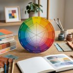
Color harmony is the foundation of pleasing combinations. It involves selecting colors that naturally complement each other, producing a sense of unity. The most common harmony techniques are based on the color wheel.
2. Play with contrast for emphasis and visual interest
Contrast helps certain elements stand out and guides the viewer’s eye. High contrast combinations like black and white create drama, while subtle contrast offers elegance and sophistication.
3. Leverage color context for mood and perception
Colors can appear different depending on the surrounding hues. Understanding this context allows you to craft palettes that evoke specific feelings or perceptions.
4. Use color schemes as a starting point, then innovate
Traditional schemes like complementary, analogous, or triadic are effective starting points. But modern design often pushes boundaries by mixing schemes or introducing unexpected hues.
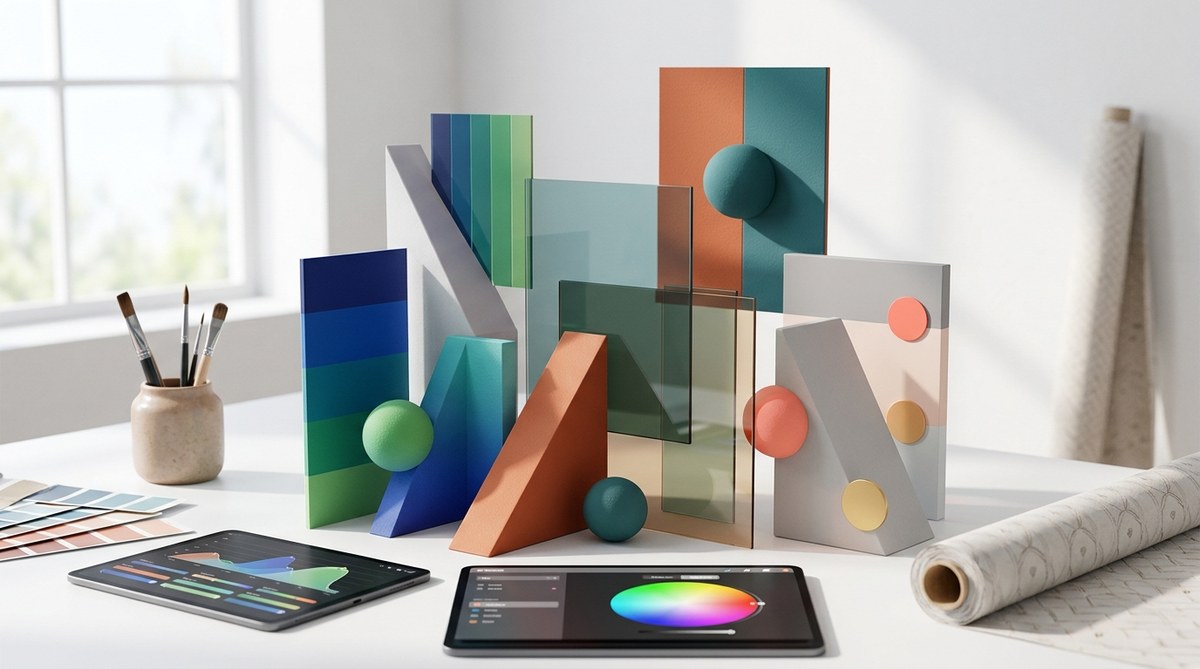
5. Incorporate different shades and tones for depth
Adding variations of a hue—lighter or darker—creates depth and dimension. This technique keeps your palette interesting without overwhelming the viewer.
Practical steps to master color combination techniques
Here’s a straightforward process to develop your skills:
-
Identify your project’s mood or message.
Think about the emotion or theme you want to convey. Bright and lively? Calm and soothing? Your goal influences your color choices. -
Choose a base color that aligns with your message.
Start with one dominant hue. It acts as an anchor for your palette. -
Select supporting colors based on harmony principles.
Use the color wheel to pick complementary, analogous, or triadic colors. For example, if your base is blue, consider orange (complementary) or teal and navy (analogous). -
Adjust shades and tones to add variety.
Lighter or darker versions of your selected colors help create contrast and hierarchy. -
Test your palette in context.
Apply your colors to mockups or sketches. Adjust until you achieve harmony and visual balance. -
Refine based on feedback and visual impact.
Step back and see how your colors work together. Don’t be afraid to experiment with unexpected combinations.
Remember these key points:
- Use tools like Adobe Color or Coolors for inspiration.
- Keep accessibility in mind. Ensure sufficient contrast for readability.
- Limit your palette to three to five main colors for clarity.
- Consider cultural associations and emotional impact of colors.
Common pitfalls in modern color pairing
| Mistake | Why it hurts your design | How to avoid it |
|---|---|---|
| Overusing bright colors | Can overwhelm viewers | Balance bright hues with neutral tones |
| Ignoring contrast | Reduces readability and impact | Always check contrast ratios |
| Too many competing colors | Creates chaos | Limit your palette and focus on harmony |
| Neglecting cultural context | Miscommunication or offense | Research color meanings relevant to your audience |
| Relying solely on defaults | Stifles originality | Experiment with unexpected combinations |
“The magic of modern design lies in the daring use of colors that challenge conventions and evoke emotions. Don’t be afraid to break the rules and experiment with your palettes.” — Expert designer
Innovative ways to combine colors in modern design
- Bold monochrome palettes: Use variations of a single hue to create sleek, cohesive looks.
- Unexpected pairings: Combine warm and cool tones for dynamic contrast.
- Gradient blends: Transition smoothly between colors to add depth and movement.
- Minimalist pops: Use a neutral background with a splash of vibrant color for emphasis.
- Color blocking: Large blocks of contrasting colors create striking visual impact.
Useful tools and resources
- Adobe Color for creating and exploring palettes.
- Coolors for generating random color schemes.
- Color Hunt for inspiration from curated palettes.
Building your own color palette from scratch
- Pick a mood or theme.
- Select a primary color that embodies that mood.
- Use the color wheel to find supporting hues.
- Adjust shades and tones to refine your palette.
- Test your palette in your design context.
- Make adjustments based on visual flow and emotional impact.
Respecting modern design trends
Current trends favor vibrant, energetic palettes, muted earth tones, and pastel combinations. The key to staying relevant is balancing trendy hues with timeless principles of contrast and harmony. Mix traditional schemes with innovative touches to keep your designs fresh and engaging.
Final thoughts: applying your new knowledge
Practicing these techniques will help you develop an intuitive sense for color pairing. Keep experimenting, analyzing successful designs, and refining your approach. Remember, effective color combinations can transform your work from good to unforgettable. Use your newfound skills to craft designs that not only look beautiful but also communicate your message powerfully.
A color palette for your creative journey
Colors have the power to evoke emotions, tell stories, and define identities. As you continue your creative journey, let your curiosity guide your experiments. Embrace unexpected combinations and learn from each project. With a solid understanding of modern color pairing techniques, you’ll craft visuals that resonate deeply with your audience and elevate your design work to new heights.